
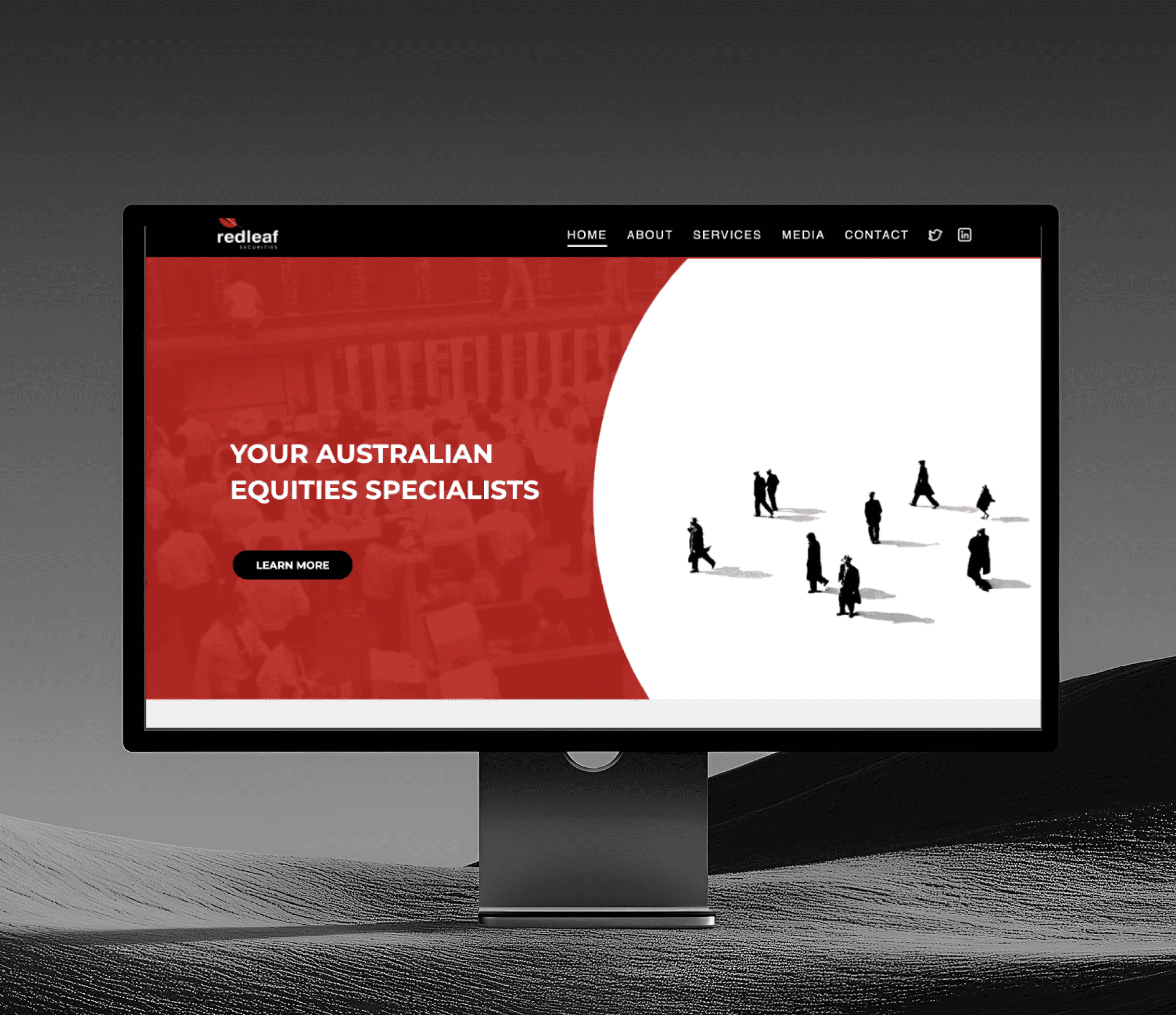
Final Prototype
My Role
I led the end-to-end design direction of Red Lead Securities’ branding refresh and website redesign, creating a unified and structured digital presence to impove engagement and attract prospective clients. Collaborating with a content writer and developer, I ensured that the refreshed brand and website positioned Red Leaf as a credible, authoritative presence in the industry.
Introduction
Breaking Beyond Traditional Boundaries
For decades, Red Leaf Securities was a well-respected name in wealth management, thriving on word-of-mouth referrals and industry connections. Their reputation was solid—but their digital presence wasn’t keeping up. With shifts in the financial landscape, prospective clients now expect a strong online presence, clear access to information, and visible proof of credibility.
Their outdated branding and website—reminiscent of the early 2000s—combined with poor, cluttered information architecture made it difficult for new clients to discover their expertise, access relevant resources, or engage with their media updates. Navigation was unintuitive, with key information buried under redundant pages, creating a frustrating user experience. As a result, Red Leaf struggled to expand its client base beyond its traditional network


The Challenge
Reintroducing and translating Red Leaf’s reputation digitally to gain a wider customer base
Our goal was to reignite and modernise Red Leaf’s brand, translating their industry reputation and expertise into a strong digital presence. The key challenges were:
Outdated branding & visual identity – Their branding —reminiscent of the late 90s/early 2000s—lacked a cohesive identity and professional appeal, making them appear outdated and overshadowed by competitors who had embraced modern branding.
Cluttered website navigation & poor information architecture – Disorganised site structure with multiple redundant pages and unclear navigation made it difficult for users to find key information, leading to frustration and low engagement.
Lack of a centralised media hub – With frequent media appearances and interviews, there was no dedicated space to showcase them, missing an opportunity to reinforce their credibility and authority in the financial industry.
Addressing the Challenges
Challenge 1:
Branding That No Longer Stood Out
Problem
Red Leaf had a strong legacy in the financial industry, but their visual identity didn’t reflect that. Their branding looked like it was from the early 2000s - wordpress template, making them seem outdated and unprofessional compared to their competitors.

Original website branding
Process
Upon discussing with the client, they were open to improvements but didn’t want a complete rebrand due to budget constraints and limited timeline. This leads us to a targeted brand refresh instead.
Conducted a competitive analysis to evaluate how industry leaders positioned themselves visually and strategically.
Aligned the branding refresh with Red Leaf’s values, emphasising legacy, trust, and authority.
Developed a solution that balanced tradition and modern appeal, ensuring they remained recognisable while strengthening their industry presence.

Mood board

Logo colour palette iteration
Solution
Refined Logo Colors – Enhanced their signature red while maintaining brand identity.

Historical Imagery – Integrated financial industry historical photos to showcase their decades of legacy and reinforce authority in the industry.
Challenge 2:
Poor Information Architecture
Problem
The website felt like a maze. Pages were buried under layers of menus, and much of the content overlapped or didn’t belong. Clients had to dig through clutter just to find basic information.
Process
Site Audit – I conducted a full review of the existing site to identify structural issues.
Competitive Research – I analysed how industry competitors structured their content for better usability.
Sitemap Analysis – Mapped out the site to pinpoint redundancies and inefficiencies.
Site Audit
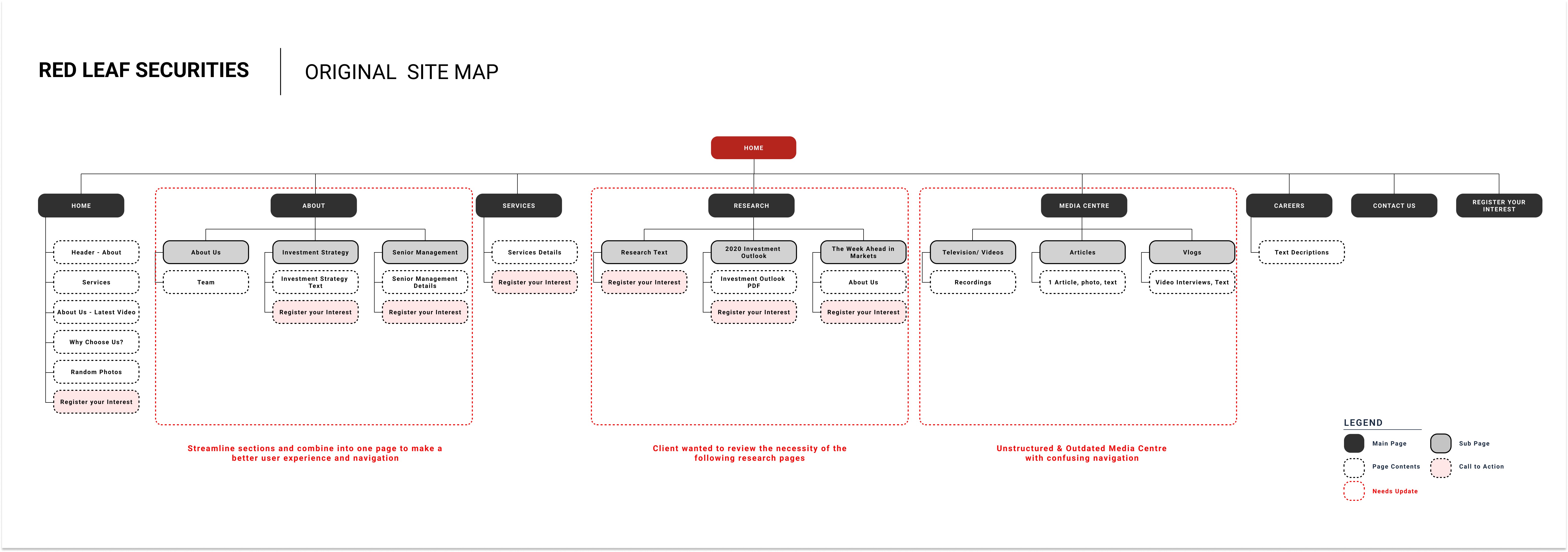
Original Site Map
Key Findings
There is no clear content hierarchy - Users struggled to find key information, reducing engagement and potential conversions.
Too many redundant pages – Multiple pages contained overlapping or outdated content, leading to confusion. Users had to click through multiple layers to find what they needed.
The Research Centre was outdated – It contained old reports and irrelevant information, taking up valuable space without adding value.
The Media Centre was nearly invisible – Media features were scattered across different pages instead of having a dedicated hub, making it difficult for users to access Red Leaf’s latest press coverage.
Solution
To improve navigation, I introduced a streamlined sitemap, removing redundant pages for a more intuitive user experience. Clear call-to-action buttons were added to guide users toward account creation or inquiries, ensuring a more direct and efficient journey. I collaborated closely with the client to refine and implement these changes, aligning the structure with their business goals.
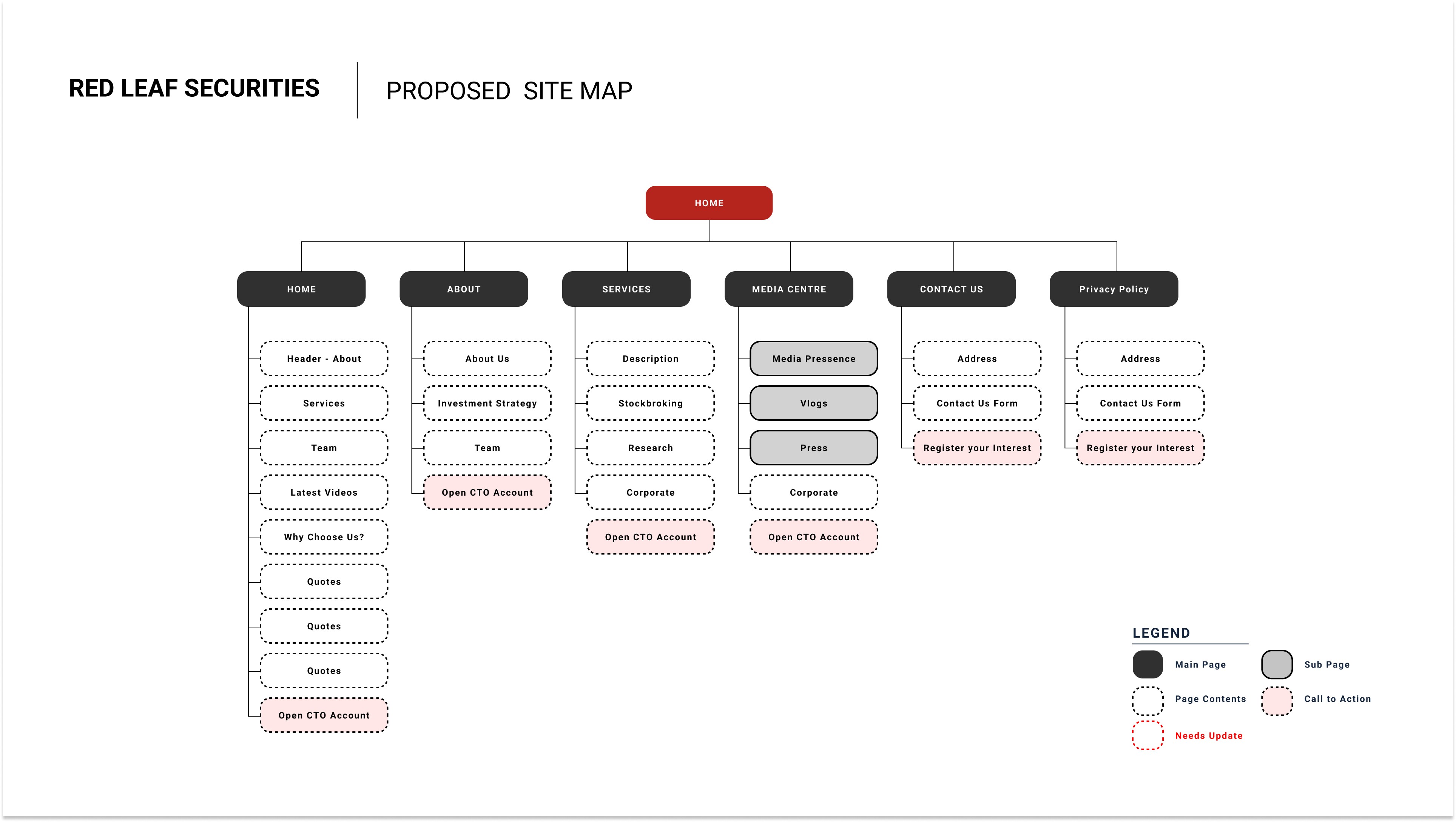
Proposed Site Map

Proposed Site Map
Challenge 3:
No Home for Their Growing Media Presence
Problem
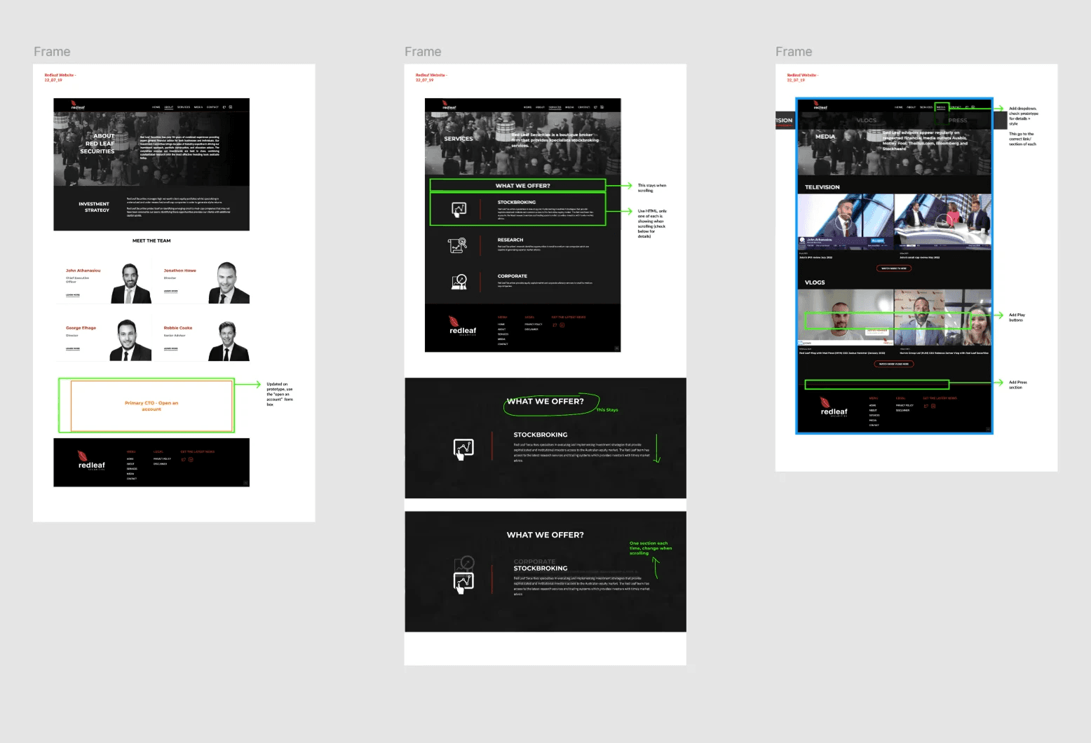
Red Leaf was regularly featured in financial news and interviews, but none of this was visible on their website. The client expressed the need for a dedicated Media Hub to house interviews, vlogs, and press articles. They were missing an opportunity to show their credibility and industry influence.
Process
I conducted an audit of their media assets and identified key content with the client to find relevant media features. These resulted to 3 main sections (TV, Vlogs, and Press Release).
I created low fidelity wireframe to test the userflow of this proposed structure to create a more seamless experience

There is no dedicated section to display the client's media content.
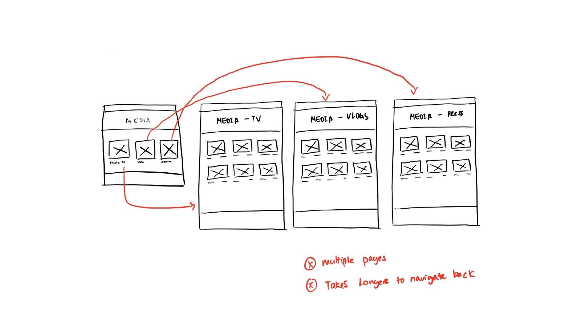
I proposed the initial iteration of the media centre.
But usability issues emerged:
Too many pages – Navigation felt fragmented.
Hard to return – Users struggled to backtrack.
Difficult category switching – Moving between media types wasn’t intuitive.

The final iteration streamlines navigation, reducing the number of clicks needed to access content, making it faster and more intuitive for users to explore interviews, vlogs, and press features seamlessly; thus the users can now easily switch between categories.
Solution
I introduced a new Media Hub, organising content into three key sections (Television, Vlogs, and Press) allowing the user to have a centralised access to Red Leaf's media assets. This key sections allows the users to find relevant content easily.

High fidelity prototype of the media centre
Finalising & Implementing the Design
After finalising the prototype, I gathered client feedback and made key refinements:
Improved navigation – Made inquiries and account registration more prominent for easier access.
Enhanced CTAs – Strengthened call-to-action placement and wording to encourage engagement.
I also implemented and finalised the updated branding across the site, ensuring a cohesive visual identity, color scheme, and typography that aligned with Red Leaf’s refreshed image.

Once approved, I collaborated with the developer for a smooth implementation by:
Providing detailed design specs and interaction guidelines.
Conducting feedback loops to resolve design-to-code inconsistencies.
Testing and refining to ensure an intuitive, high-quality user experience.


The Outcome
Stronger Engagement & Industry Presence
Post-launch, Red Leaf reported to us a measurable increase in engagement:
Higher investor inquiries – A noticeable uptick in contact form submissions and account registrations.
Improved content interaction – Users spent 30% more time engaging with reports and market analysis in the new Media Hub.
Reduced navigation drop-offs – Streamlined site architecture led to smoother user journeys, with fewer users abandoning key pages.
Beyond just a visual refresh, the redesign strengthened Red Leaf’s digital presence, making it easier for prospective clients to connect, engage, and trust their expertise in the financial industry.