
Final Prototype
My Role
I was the lead designer for Authium’s rebranding and website project I worked closely with the account director to shape their brand strategy, develop a cohesive visual identity, and design an investor-focused website. I led the entire end-to-end design process of a new website—from research, wireframing, and prototyping to final UI design—ensuring the site effectively communicated their mission, projects, and investment potential.
Introduction
Framing the Story Before the Pitch
Authium is a newly established lithium exploration company preparing for its upcoming IPO. At the time, they had no website, no existing digital presence, and only a basic logo with an underdeveloped brand. Their only investor-facing material was simply a underdeveloped powerpoint presentation—far from enough to build trust or attract investor attention.
The task was clear: create a credible and engaging digital presence that could communicate who they are, what they stand for, and why investors should believe in their vision. They wanted to stand out in a competitive mining landscape, gain visibility, and offer investors a compelling reason to invest.
Starting from scratch, I was brought in to lead the end-to-end design—from developing a cohesive brand identity to designing and structuring their first investor-focused website. The goal was to build something that didn’t just look good, but that clearly communicated their credibility, project highlights, and long-term value.
The Challenge
No Identity, No Website, and an IPO on the Horizon
Authium needed to establish a strong brand and digital presence to attract investors ahead of its IPO. They wanted to highlight their net-zero lithium extraction process, strategic location, and experienced leadership team to build credibility in a competitive market.
The key objectives included:
Brand Development – Refreshing and develop their outdated branding to stand out from their competitors and to showcase their credibility and positioning in the lithium market
Website UX/UI – Creating an investor-focused website to showcase their credibility, leadership, and projects.
Creating an Investor Centre page for future IPO use - Desining a structured hub for investors to gain company's update, to be used when the company goes public.
The goal was to create a professional, investor-focused platform that reinforced trust and maximised engagement.
Addressing the Challenges
Stage 1: Rebranding
Differentiating Authium’s Brand from Competitors
Problem
Authium had an existing logo, but no fully developed brand identity—no defined color palette, typography, or visual direction. Upon researching their competitors, I found that their branding closely resembled existing lithium industry norms, primarily using blue, turquoise, and green tones. This made it difficult for Authium to stand out and establish a unique identity.
Additionally, they lacked professional photography and videos of their mining site, which limited their ability to showcase the scale and potential of their lithium project.

Process
I reviewed their current branding and assessed how it was applied across their existing investor materials.
Conducted competitor analysis to identify industry trends in branding and positioning
Highlighted key issues:
Authium’s colors were too similar to competitors, making differentiation difficult.
Lack of professional site photography meant investors had no visual reference for their mining project.
Solution

Mood board
Colour Palette
Balanced trustworthiness (blue) with innovation (purple) to differentiate Authium from its peers

New Logo Style
With a modern & minimalist style that aligned with their future-focused, net zero vision
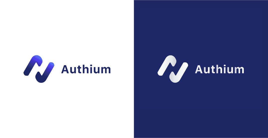
Unified visual identity
With a modern & minimalist style that aligned with their future-focused, net zero vision
Videography
To elevate Authium’s credibility, we proposed capturing on-site drone footage of their lithium project. This gave the brand a tangible sense of place and helped investors see exactly what they’d be backing—a real project, not just a pitch deck.
Launch & Impact
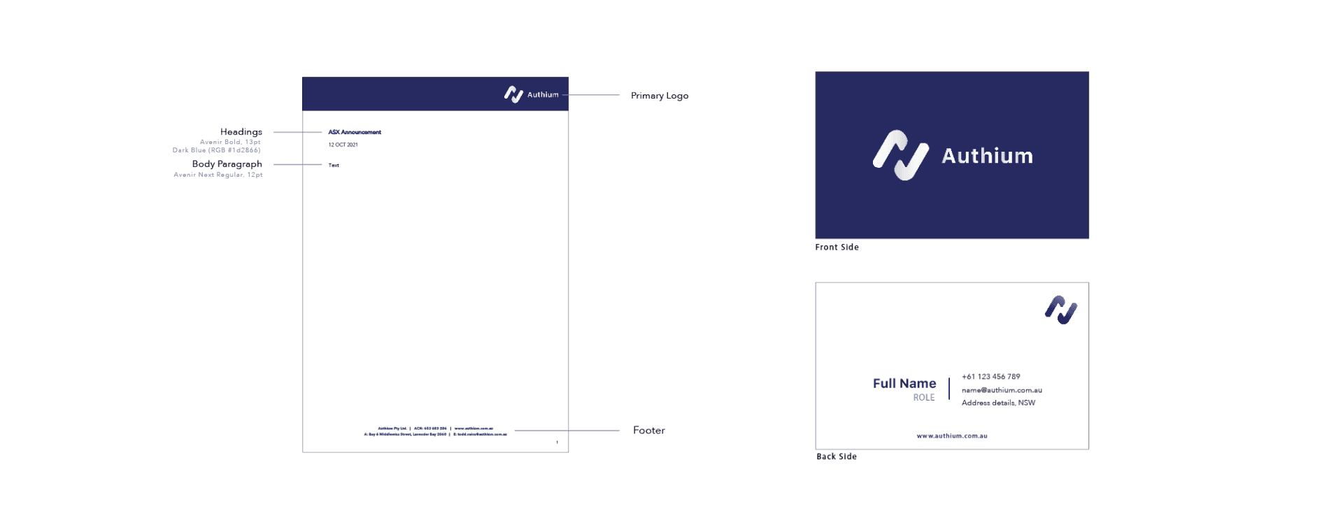
With a stronger, more distinct brand identity, Authium now stands out from competitors while reinforcing its vision as a forward-thinking lithium company. The updated branding also provided a solid foundation for their website and investor materials, ensuring visual consistency and professionalism ahead of their IPO.
Stage 2: New Website Built
Designing an investor-focused website to showcase their project positioning in the industry
Problem
After refreshing Authium’s branding, the next step was to design their website from the ground up. The company had no existing website or digital presence, which meant there was no baseline to improve on—everything had to be created from scratch.
The goal was to create a site that:
Builds credibility and earns investor trust in a competitive market
Clearly communicates the company’s projects, positioning, and leadership
Centralizes updates and key content, removing the need to navigate multiple external sources
Process
Understanding What Investors Care About
I started with reviewing Authium’s investor presentation and worked with the client and account director to identify the key messages that needed to come through on the site. To dig deeper, I spoke with the broader team—including investor brokers—to understand what investors actually expect from ASX-listed mining companies and where they typically go to find that information.
Learning from the Landscape
I followed up with a competitor analysis, reviewing how other ASX-listed mining companies structured their websites—how they introduced themselves, presented projects, and shared investor info.
I translated these into low-fidelity wireframes to spot common patterns and missed opportunities. This helped shape a content structure for Authium that felt clear, focused, and built around what investors actually look for.

Competitors Site Structure
Key Findings
Client
The client wanted to highlight their net-zero/low-impact lithium production, which differentiates their positioning in the industry.
Competitors
Most competitors have been in the industry much longer and have a higher market cap. They provide a centralized investor center to showcase updates and key information.
Investors
Investors currently have to visit external stock market sites to find company stock prices, announcements, media updates, videos, and articles across various platforms.
Investors want a clear understanding of the project and easy access to company updates.
Solution
Understanding What Investors Care About
Using what we learned from investor interviews and competitor analysis, I designed a structure that made it easy for investors to understand who Authium is, why they matter, and why they’re worth investing in.
Rather than overwhelm with dense information, I broke the content into clear, purposeful sections based on what investors typically look for. I created a user flow and site map that reflected the natural path of investor curiosity—from understanding the company, to exploring the team, to diving into the project details.
The structure included:
About – Framing Authium’s identity and purpose in simple terms
Team – Highlighting the leadership’s proven track record to build trust
Projects – Bringing the opportunity to life through visuals and key highlights
Investor Centre – Designed as a future-ready hub to house IPO-related updates
Contact – Removing barriers for investors to get in touch or follow up
This approach made the site intuitive to navigate and anchored in investor logic, helping Authium come across as focused, credible, and IPO-ready—even without a public listing yet.

Proposed Site Map
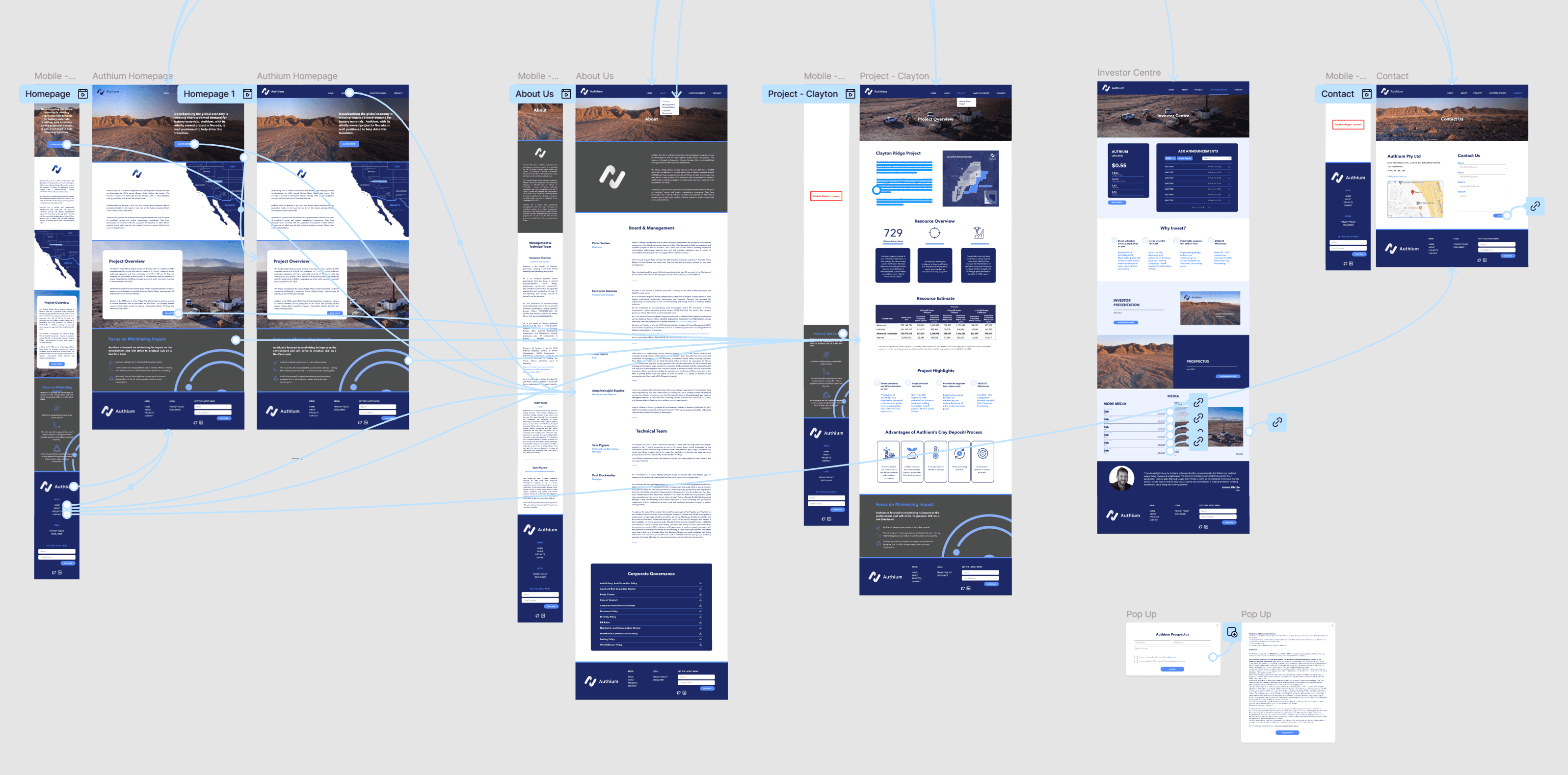
Proposed Site Map
Stage 3: Getting into the details
Preparing an Investor Centre for Future IPO
Problem
Although Authium wasn’t publicly listed yet, they needed a dedicated Investor Centre ready for when the time came. The goal was to create a central hub where investors could eventually access company updates, reports, and announcements—all in one place.
It had to be clear, easy to navigate, and designed with future investor expectations in mind—even if the content didn’t exist yet.
Process
Building on the research and structure established in the previous challenge, I mapped out the Investor Centre as a dedicated space for future IPO communications. I applied the same investor-first lens—prioritising clarity, relevance, and ease of access.
To guide the structure, I reviewed how other companies presented their investor centres and identified patterns in layout and content. From there, I defined key sections that would allow investors to quickly access stock highlights, announcements, and reports once the company goes public.
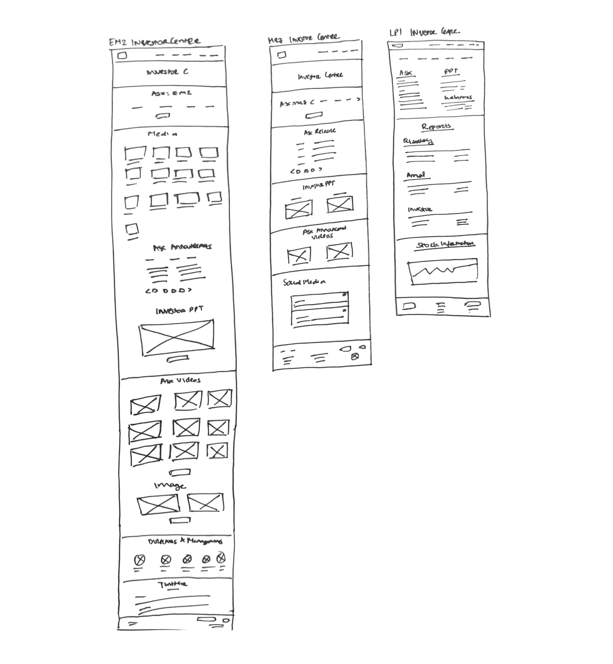

Using the site map and insights from earlier research, I created a wireframe to explore how the Investor Centre would be structured and navigated. This included outlining how key elements—like reports, announcements, and presentations—would be displayed clearly and accessibly.
After several iterations, I refined the flow and integrated Authium’s new branding into a high-fidelity prototype. The goal was to create a page that felt cohesive with the rest of the site while being distinct enough to serve its specific purpose when the IPO launches.

Investor Centre - Prototype Iteration
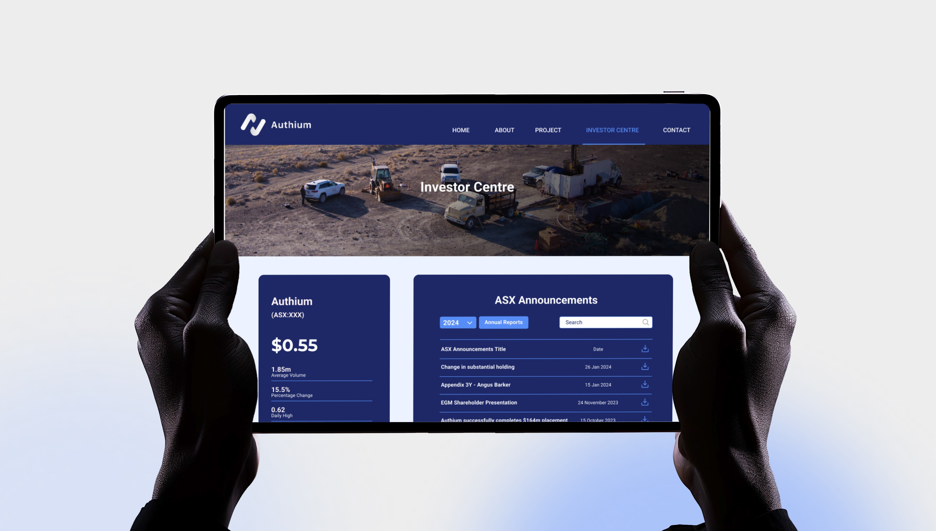
Solution: A Future-Ready Investor Hub
The final Investor Centre design acts as a clear, intuitive framework built for future investor engagement. It includes sections for company announcements, presentations, media coverage, and contact—all laid out in a way that’s easy to browse and ready to be populated once Authium goes public.

Investor Centre - High Fidelity Prototype
Final Steps: Aligning with Stakeholders and Bringing It to Life
Once the high-fidelity prototype was complete, we gathered feedback from the client. They reviewed the design with internal stakeholders and sought legal approval to ensure all content—especially around their future IPO—met compliance standards.
As part of this process, the client also provided additional materials, which I integrated into the site:
Company policies and legal disclaimers
Prospectus and investor documents
Updated copy and media for key pages
From there, I implemented final design adjustments and refined the UI across the board by:
Applying the new branding consistently across all pages
Adding iconography and graphics that aligned with the visual system
Fine-tuning layout and details based on stakeholder feedback
Once the design was approved, I collaborated closely with the developer to ensure a smooth handover and implementation. This included:
Sharing detailed design specs and assets
Reviewing early builds to maintain visual and functional accuracy
Troubleshooting edge cases and refining interactions as needed
This collaboration helped ensure that the final build matched the design vision and was ready for a seamless launch when the time came.


The Outcome
Built for Visibility, Trust, and IPO Readiness
The work delivered more than just a refreshed look—it helped Authium present itself as a credible, investable company. With a cohesive brand identity and a focused digital presence, the company is now better positioned to engage investors and move confidently toward its IPO.
Post-delivery, Authium reported clear signs of progress:
Increased visibility – With a new website and cohesive branding, Authium now has a clear public presence to point investors to, where previously there was none.
Improved investor trust – Stakeholders noted stronger confidence in how the company’s mission, leadership, and project were being communicated.
Legal and internal approval – The final design passed internal stakeholder reviews and legal approval, making it fully compliant and ready for IPO communication.
IPO-ready infrastructure – The Investor Centre was built and structured ahead of time, allowing the team to publish updates seamlessly when the IPO launches.
By combining strategy, design, and brand development, the project gave Authium the tools to build credibility, attract investor interest, and scale with confidence.